Work Experience
Board App - TCS
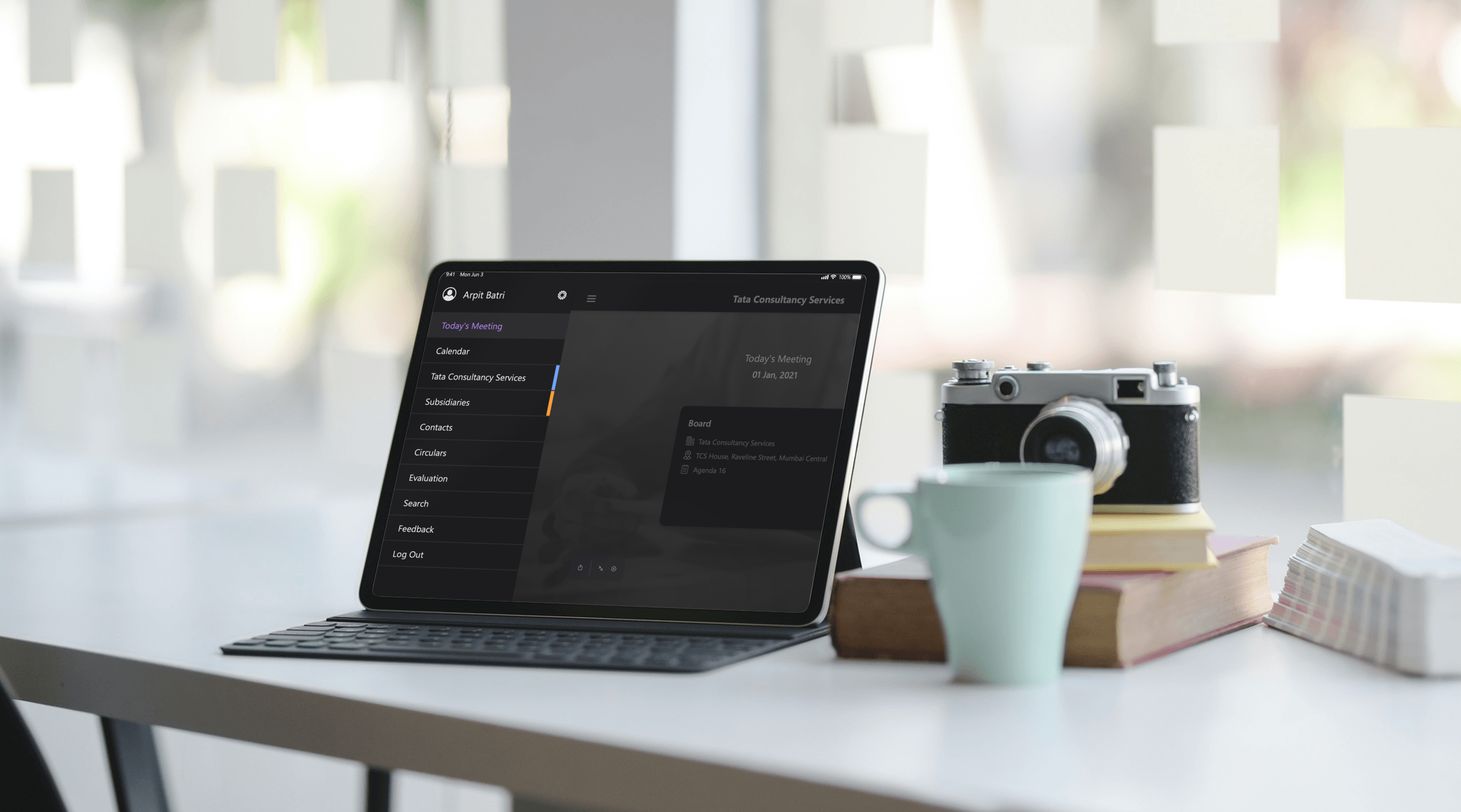
The iPad first app facilitates conducting meetings on the iPad. Participants can schedule a meeting, attend a meeting, and view all meeting documents. Inside the Tata Sons group, C-level executives use this app for their board meetings, hence the name 'Board App'.
Project Overview
The iPad first app facilitates conducting meetings on the iPad. Participants can schedule a meeting, attend a meeting, and view all meeting documents. Inside the Tata Sons group, C-level executives use this app for their board meetings, hence the name 'Board App'.
My Role
I was directly involved with designing and updating the app's User Interface keeping in the mind the latest UI/ UX trends, techniques, and technologies. I researched and created the dark mode UI for the entire application (Published Medium Article).
Project Goals
Enhance the overall User Experience by adding intuitive UI features to access meeting documents.
Make the design accessible.
Reducing the complexity of the support team's backend ecosystem processes.
Project Execution
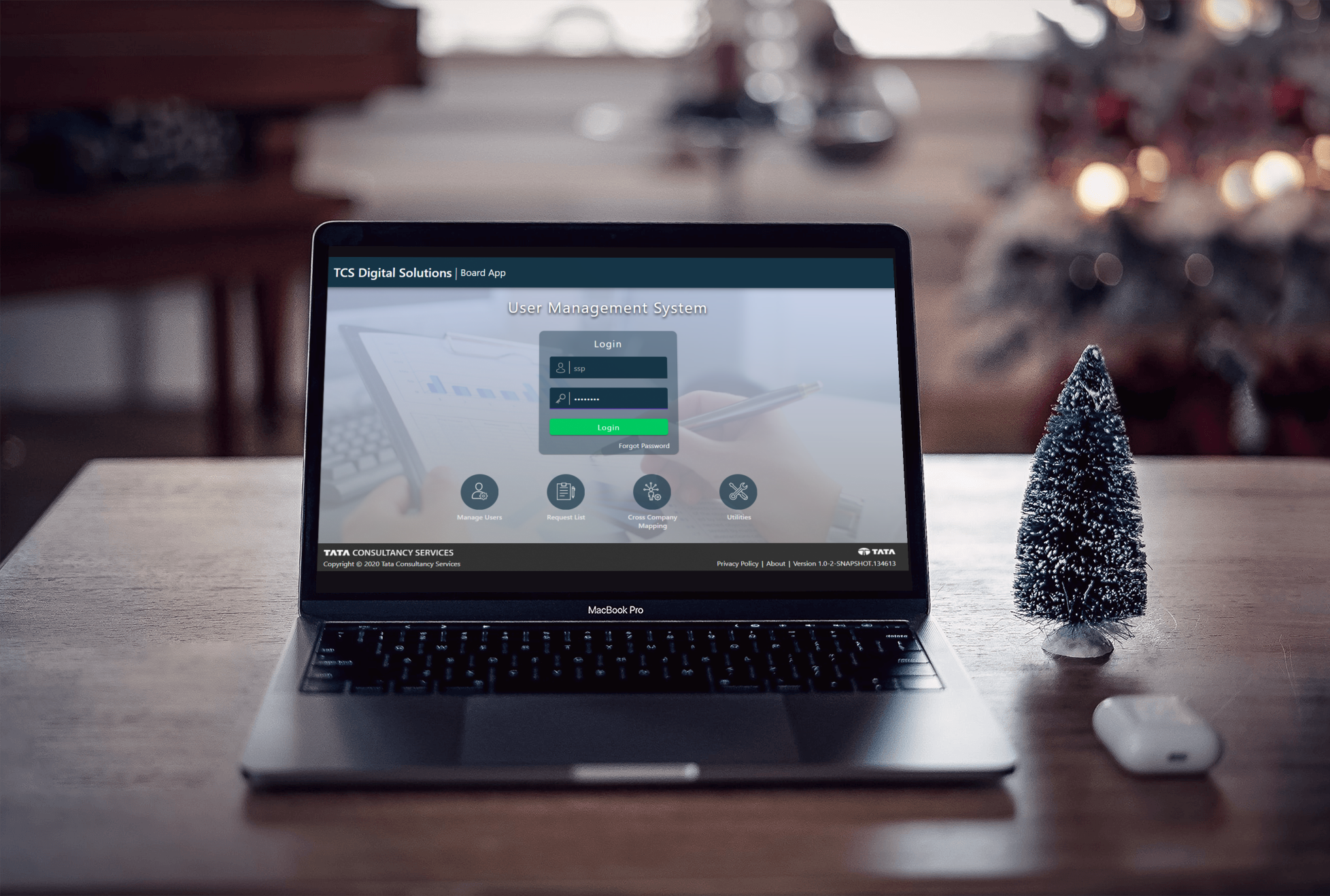
The TCS Board app is part of an ecosystem of applications. As the final product, the Board app is in the spotlight, but we also have the MMS (Meeting Management Service) and UMS (User Management Service).
Research
As the UMS and MMS services are built on the Angular framework, we had to adhere to the Angular Design guidelines, also known as Google’s material design language. Our interview process involved speaking with several internal teams that use these services on a daily basis to streamline their processes.
We had to reserch for competitors in the market that offers the same functionality. Thus competitive analysis was in order to
get insipiration and enhance our product.
We had to strictly follow the WCAG accessibilty standards since this app would be used by majorily people in there 50’s and later. WCAG 2.1 was adhered.
We researched new user behavior using tools such as session recordings, as well as by having test users complete the tasks using unmoderated remote tests. We wanted to establish a baseline for future comparison, as well as to begin identifying usability issues.
As we were looking for incremental improvements, our approach was always going to be focused on iterative design, comparative testing, analysis, and repeat.
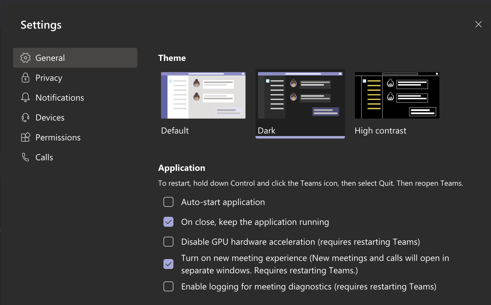
As you can see below, I drew inspiration from what I was using in my day-to-day work: Microsoft Teams and Outlook in Dark Mode. In this way, an overall mood was created for the application's Dark Mode User Interface.
Concepts & Prototypes
As Meeting Documentation was a feature that existed already, we were looking to build off of the positives and improve where there were opportunities.
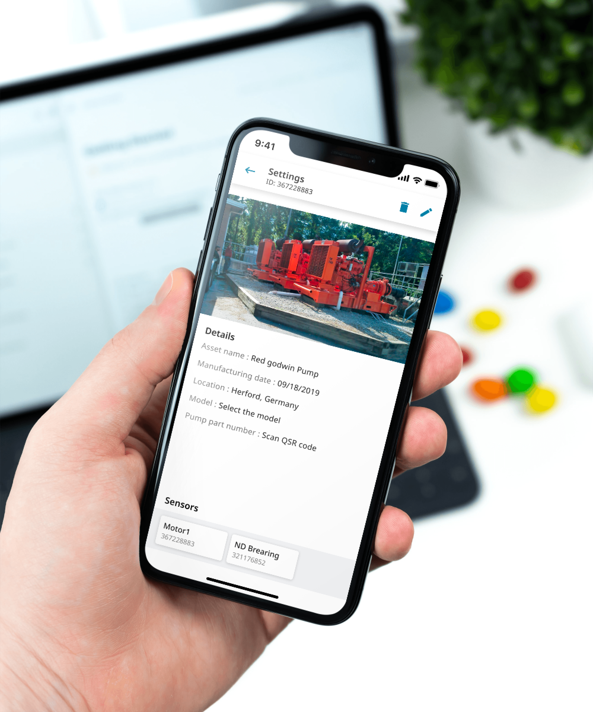
Making it simple for users to access meeting documents with ease, such as overlaying intuitive contextual help on existing screens to provide detailed information about all features and gesture control.
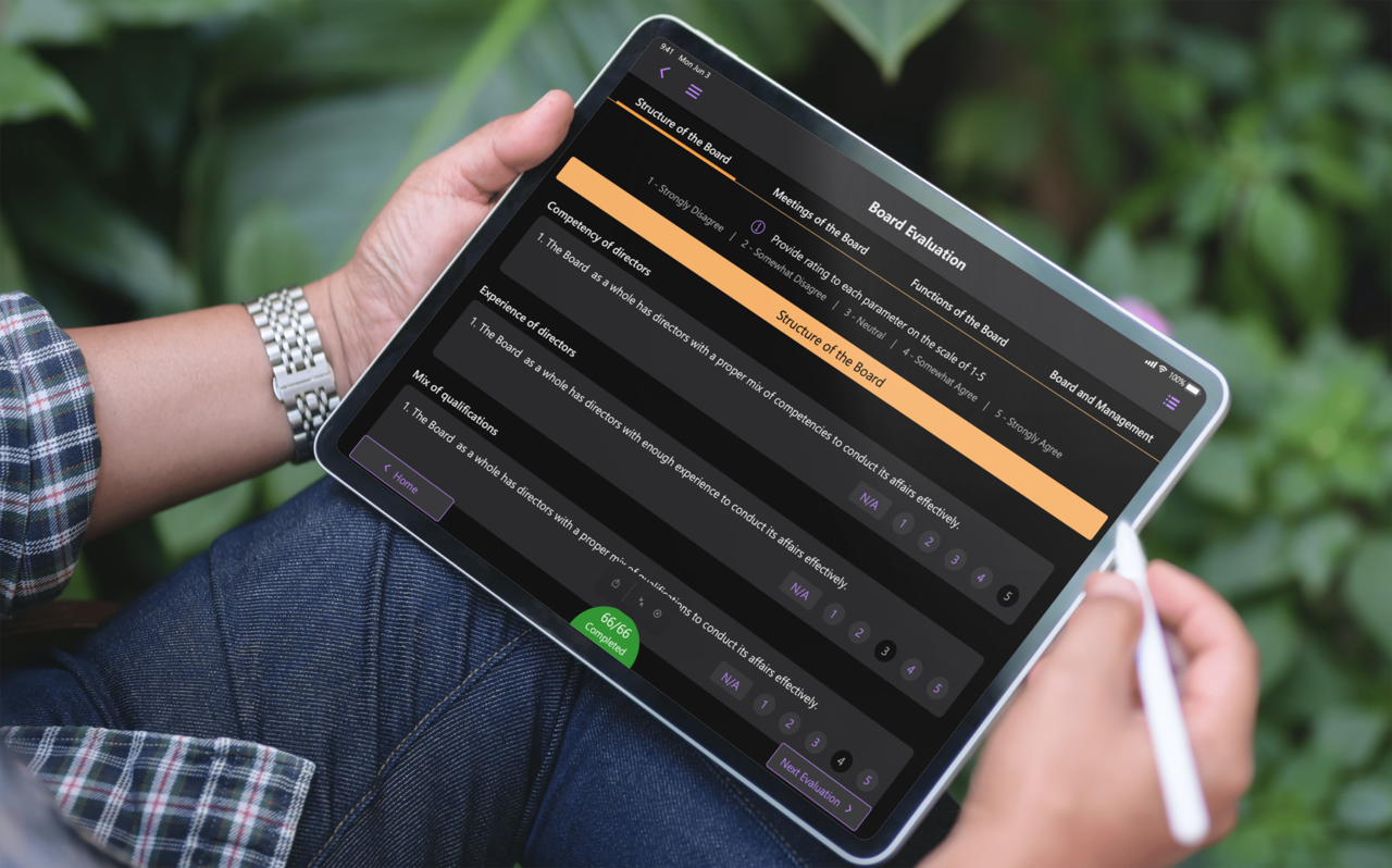
Annotation tools such as freehand annotation, highlighter, textual notes, and bookmarks can be included in meetings as additional features.
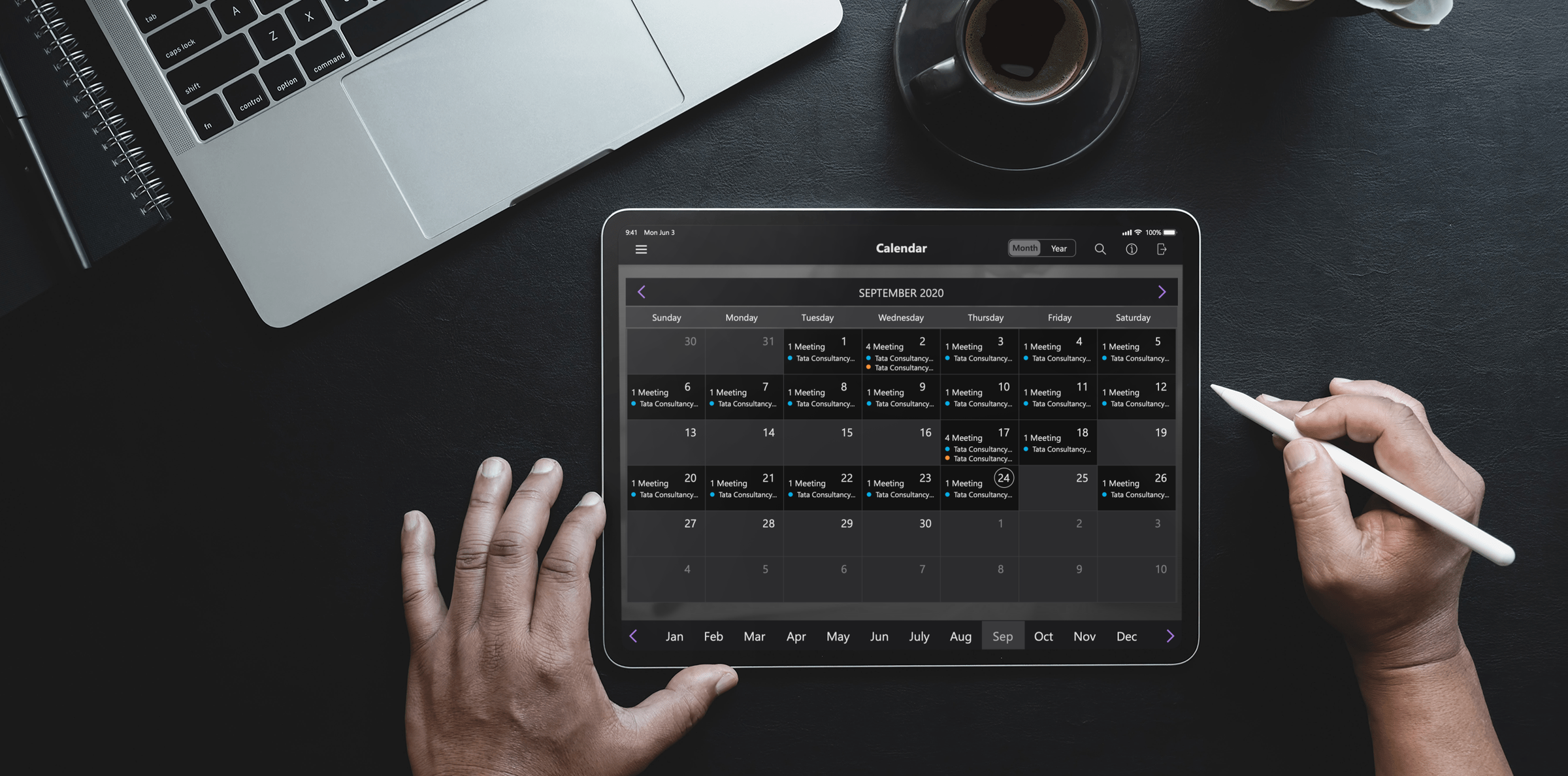
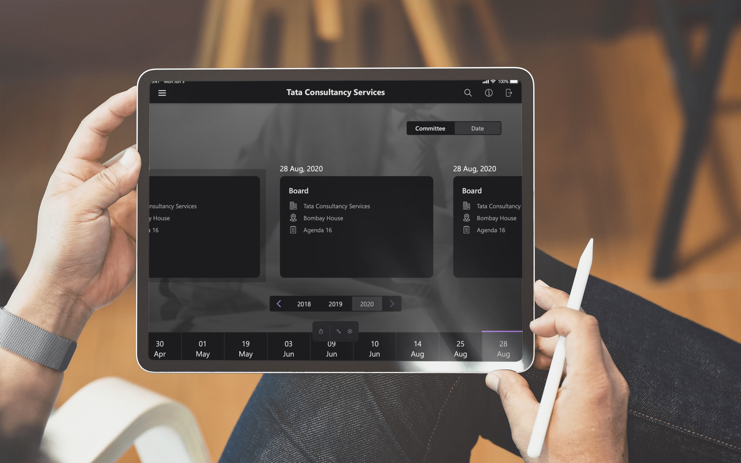
Provision of different views and features to provide seamless user experience. To name a few, we have Calendar view for all the scheduled meetings and Agenda view for an overview of all agendas.
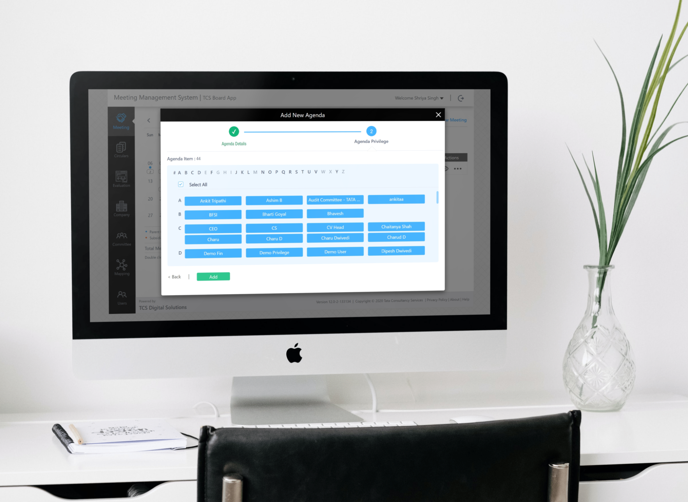
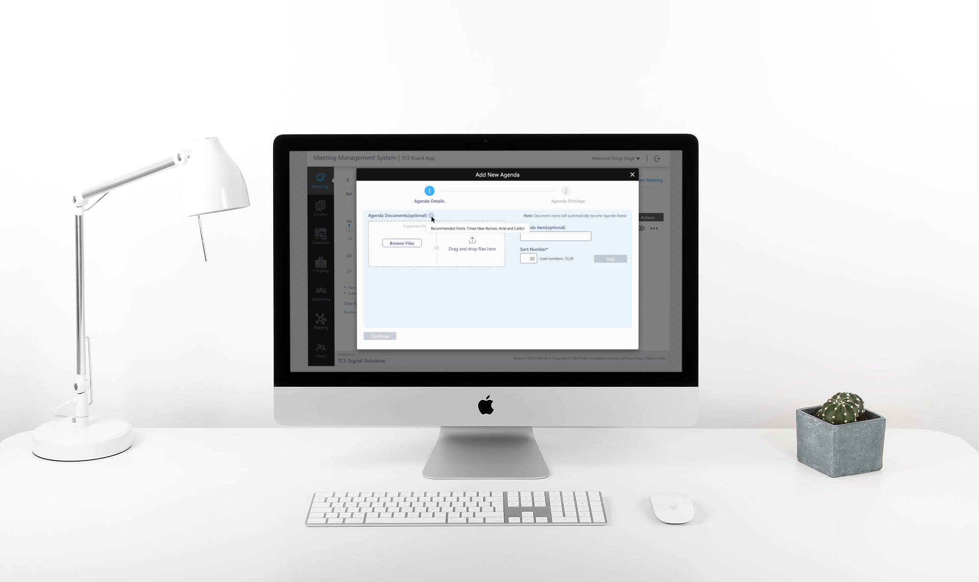
We are simplifying the user addition, deletion and addition of a new team for the UMS and MMS services.
Comparative Testing and Iterations
We took the favourite designs and tested them with a small percentage of real users. At first, we Created prototypes that were run by several internal users, iterating based on the feedback, and ultimately tested with a set of external users to validate the approach.
The feedback on this approach was overwhelmingly positive. We did identify a few areas of improvement, in particular dealing with Senior citizens that were tech savy wanted the task to follow the K.I.S.S (keep it simple silly) principle in design.
Outcome
We improved the accessibility and usability of the product through iterative design and analysis. Our team was yet to decide on a metric to measure the product's suitability for new users. But in an ongoing internal survey, 89% of users said they were satisfied with the product. Our long-term plans include adding intuitive reporting features as well.
72%
MRR GROW
50%
Lead Increase
45%
Traffic Increase
More Work
Optimyze - Xylem Inc
Condition monitoring to optimize your bottom line.
The optimyze™ modular condition monitoring solution periodically monitors system vibration and temperature and allows everyday users to access simple-to-use monitoring tools from iOS or Android mobile devices.
MetroX - Amdocs
Supporting Business Operations
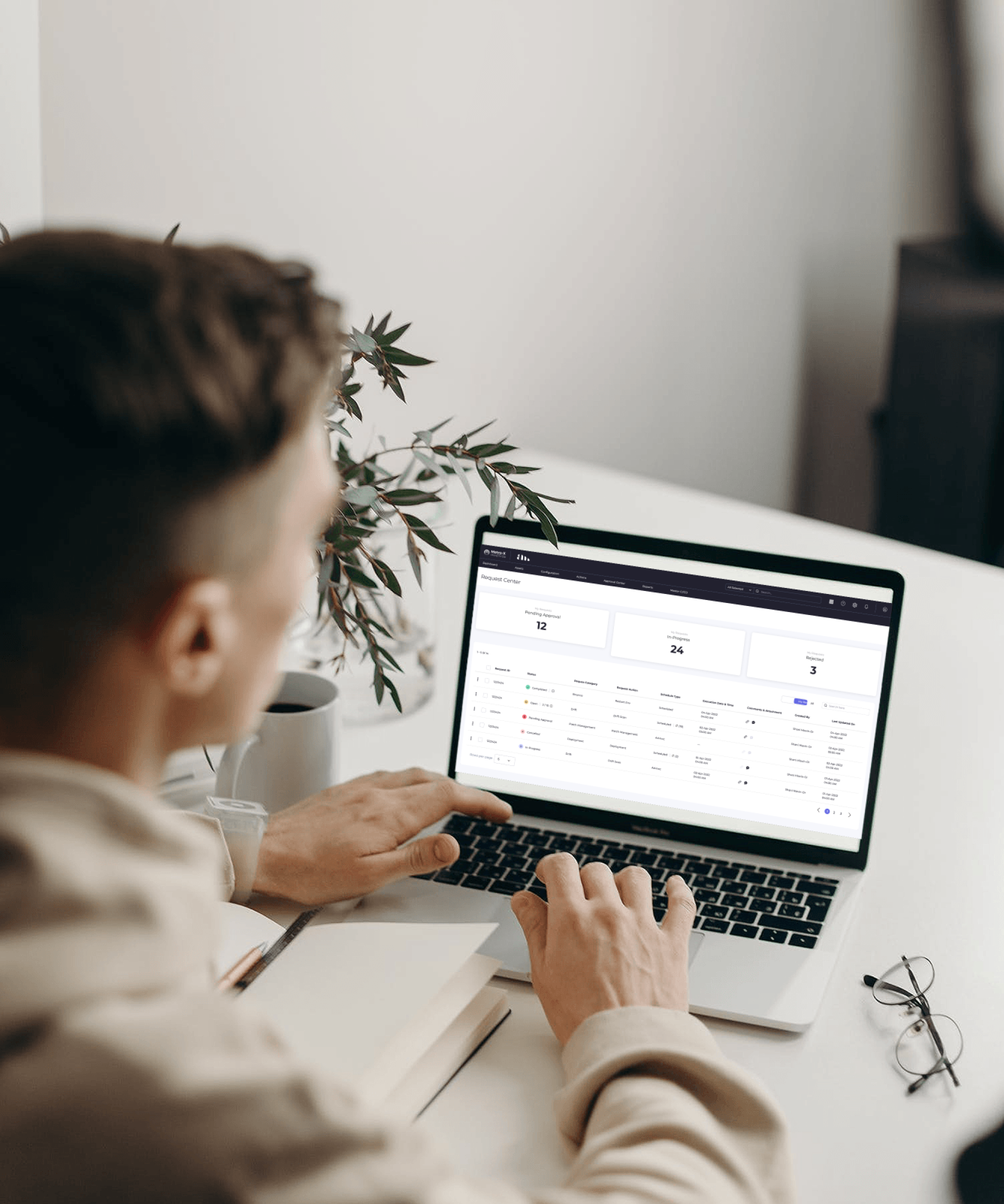
Metro-X is an Research and Development initiative by Amdocs focused on creating a suite of capabilities that will enable Amdocs and its customers to perform a real DevSecOps transformation.
Contact me
Work Inquiry
Copyright By Arpit Batri 2022